Client project · Website redesign
D6 Tabletop Café
Redesigning a local board game café's website so visitors can book a room, find events and browse the menu without calling staff.
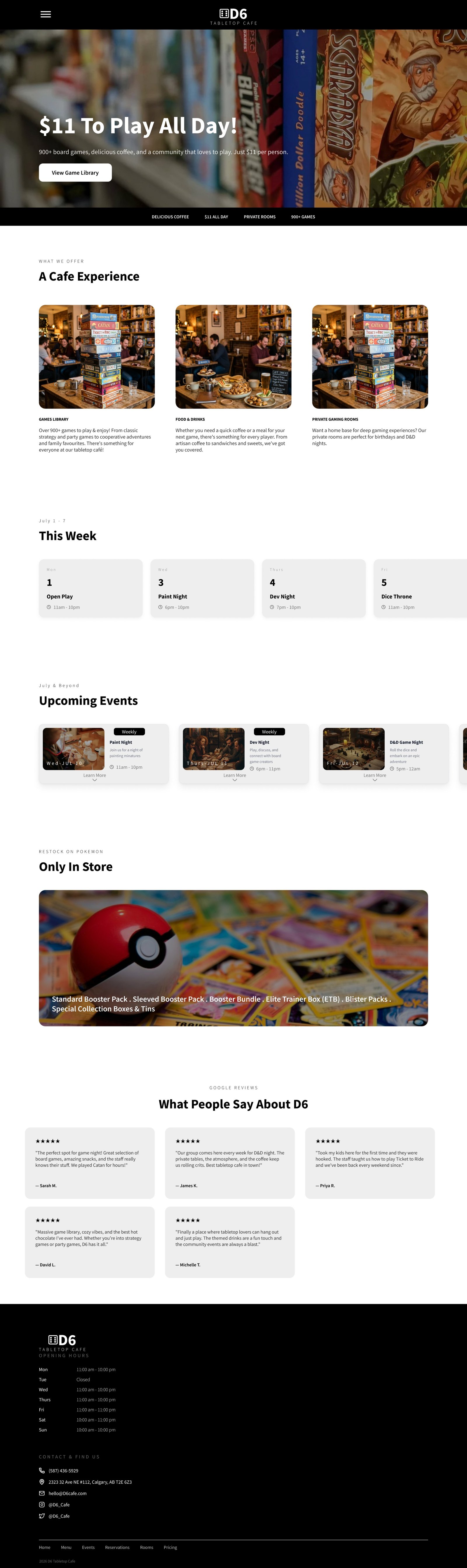

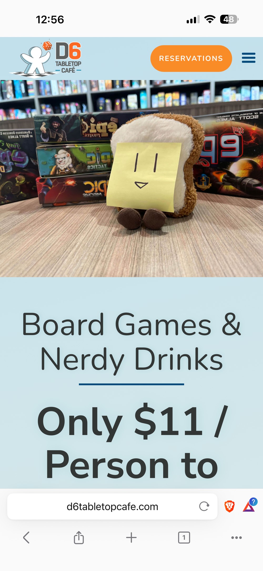
Scroll inside the screens to see the full homepage
The problem
An outdated, cluttered site with an unreliable booking flow. Customers called staff for answers the website should have given them.
What I did
Stakeholder interview, heuristic evaluation and competitive analysis, then a mobile-first redesign of the homepage, menu, events and reservations.
The result
The owners want to adopt the design. Testing ratings rose from 8–10 to 9–10 out of 10 after my fixes.
Overview
A 3-month freelance website redesign for D6 Tabletop Café, a local board game café. As the sole designer, I identified and addressed critical usability issues, including an outdated visual design, a cluttered homepage, an unreliable reservation flow, and unintuitive information architecture.
The work was shaped around the client's business goals: driving foot traffic, reducing staff enquiries, showcasing the game rooms, and promoting events. I designed the experience mobile-first, with a desktop version of the homepage.
01
Research & analysis
Stakeholder interview
I reached out to the café owners about redesigning their website. They loved the idea and were eager to collaborate. In a stakeholder interview, their main focus was functionality: making the site clear and intuitive for visitors. They wanted:
- Events: a revamped events page that clearly communicates event details and makes upcoming events easier to discover.
- Menu: a completely overhauled menu with richer information about drinks and snacks.
- Customer questions: answers to common questions, so visitors don't need to contact staff.
- Game rooms: a way to show potential visitors what the rooms look like.
Heuristic evaluation
I evaluated the existing site against Nielsen's usability principles. Three high-impact issues stood out:
- User control and freedom
- Consistency and standards
- Flexibility and efficiency of use
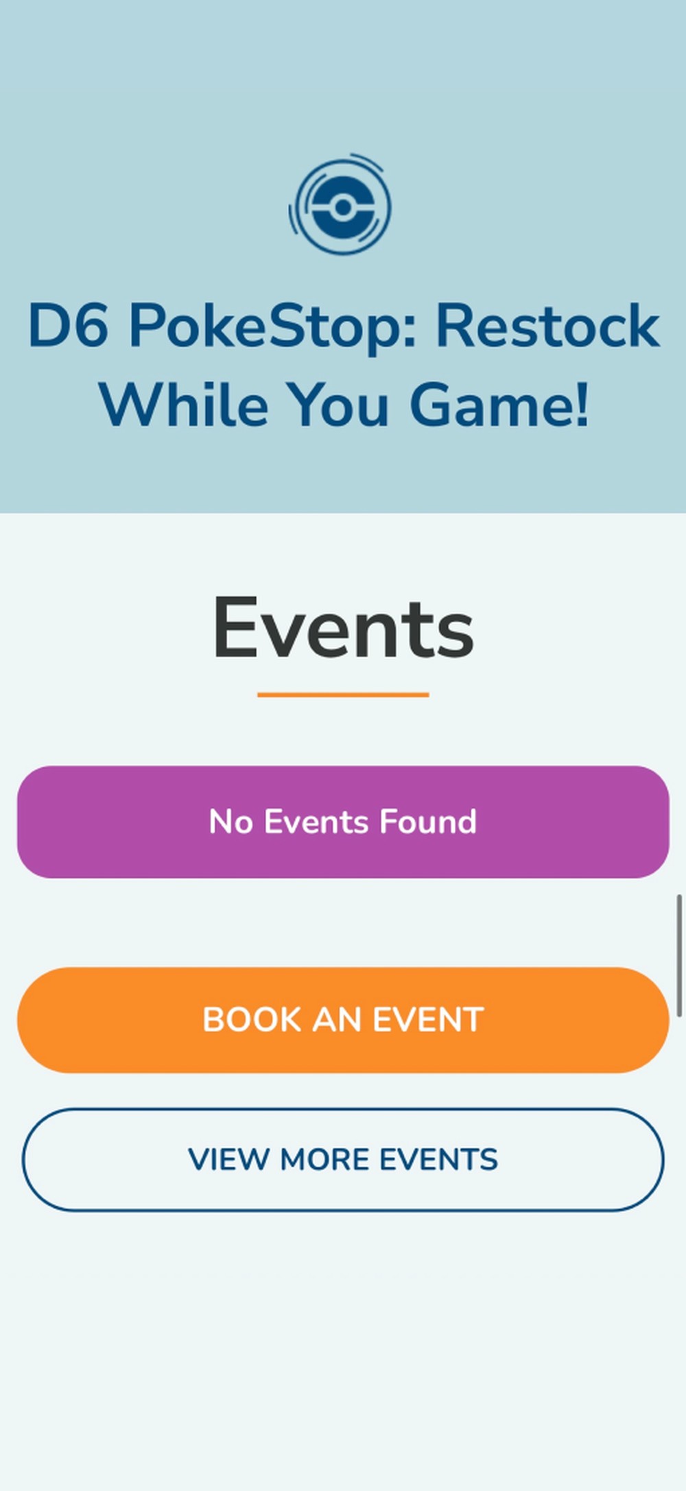
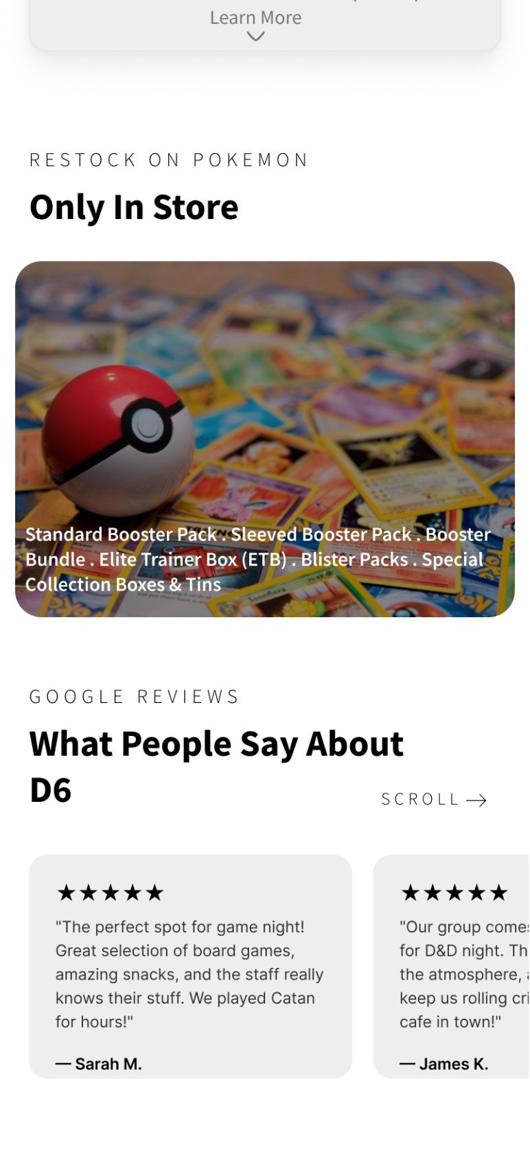
While reviewing the homepage content, I also noticed a card announcing a Pokémon card restock that didn't say which products were available or whether they could be bought online. I rewrote it to state up front that the restock is in-store only, and listed the available products, from booster packs to Elite Trainer Boxes and collection tins.
Competitive analysis
I examined a direct competitor, Table Top Café, and an indirect one, Ogre's Den Gaming Club, screen by screen. I rated what I found against five usability qualities: learnability, memorability, errors, efficiency and satisfaction. That surfaced industry standards and gaps, like minimalist navigation, clear dietary information, and intuitive interactive elements.
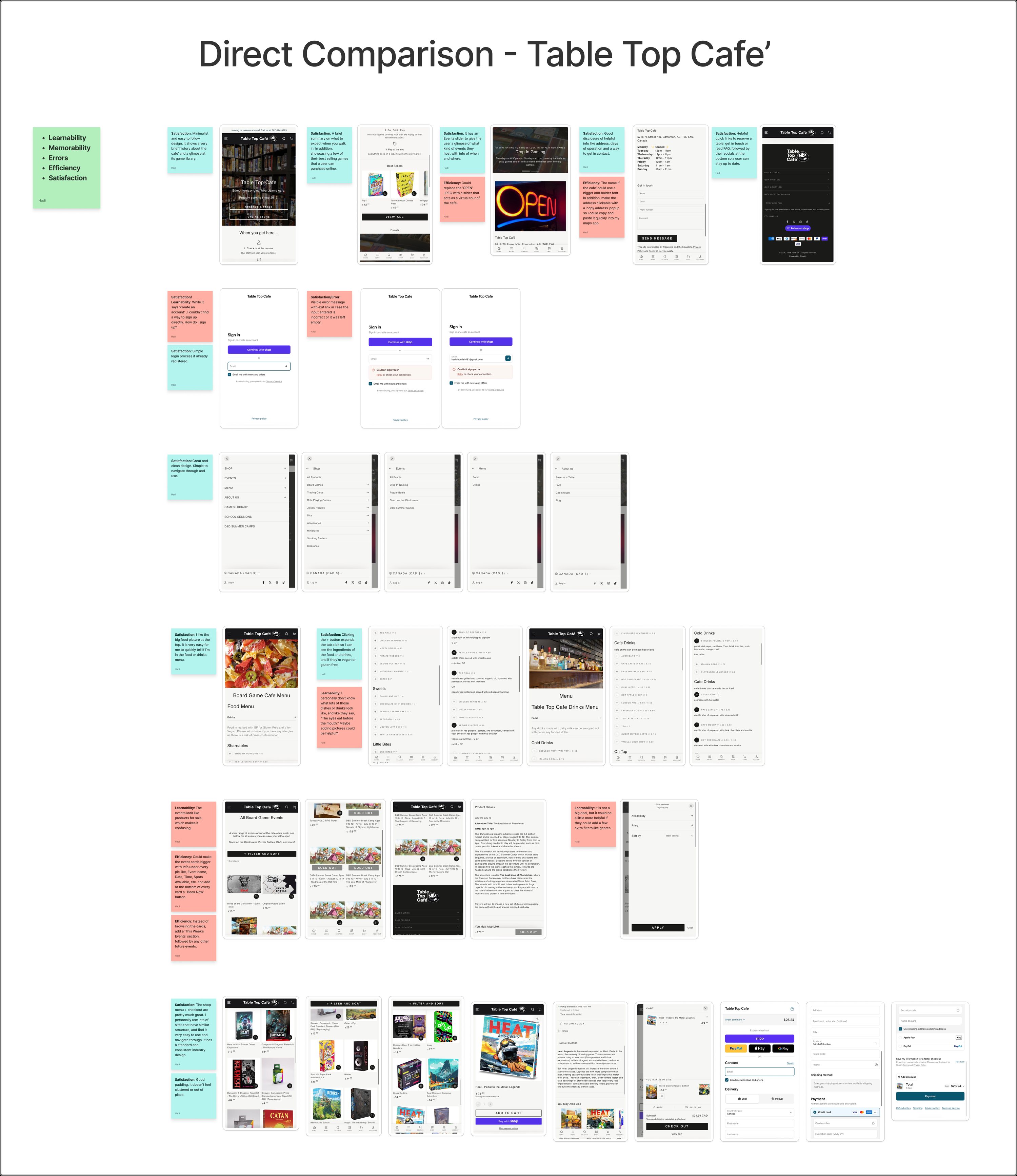
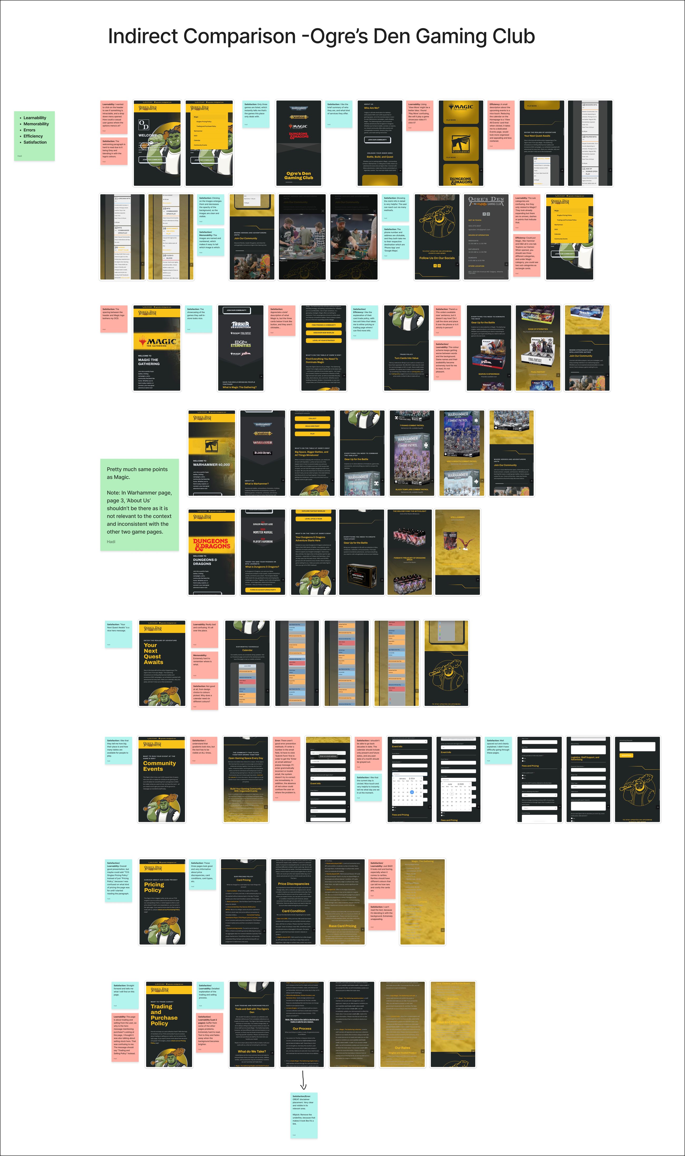
Click a board to open it full size
Mind map
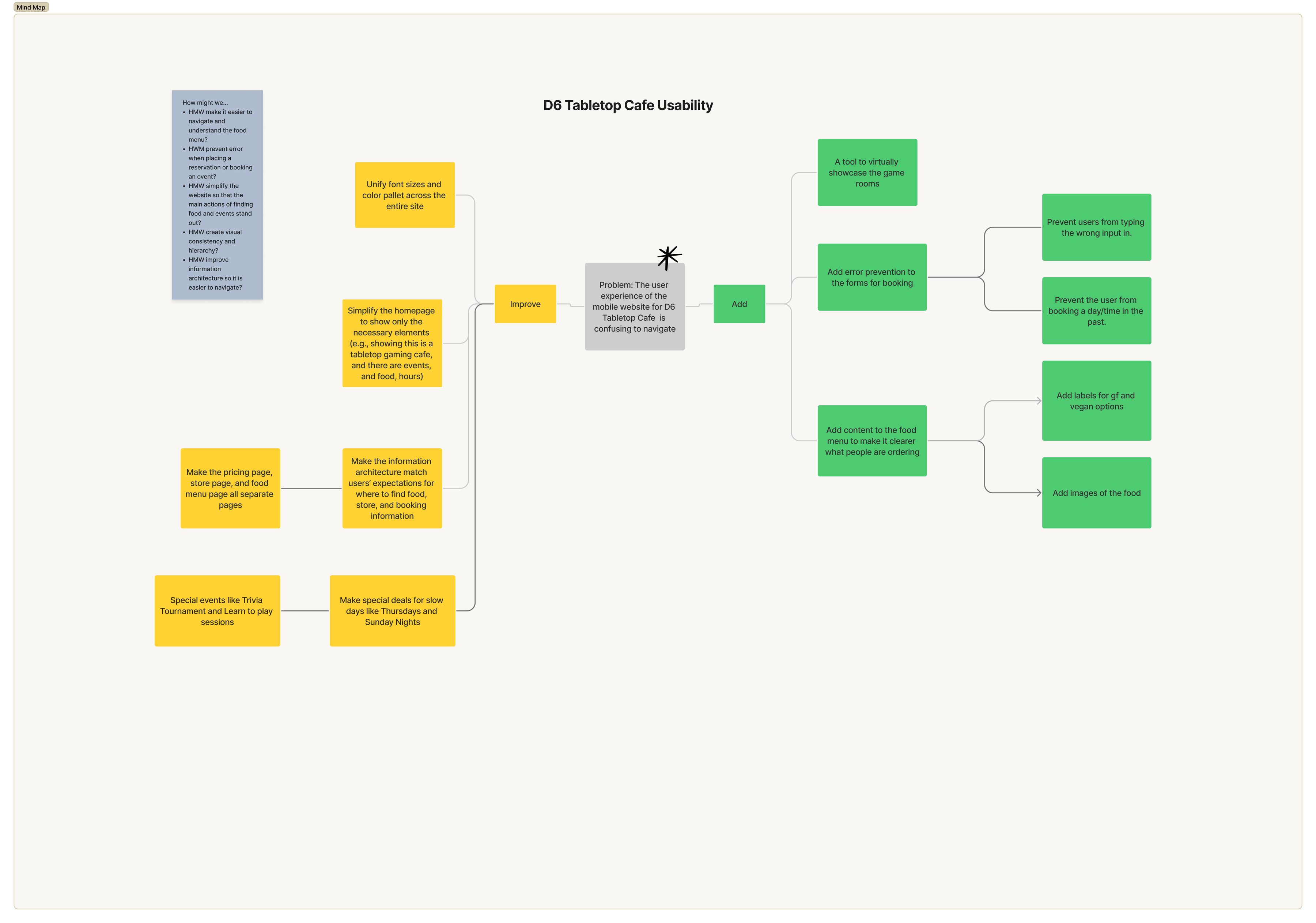
To synthesize everything, I built a mind map that sorted recommendations into two groups. Improve: refine the visual language, simplify the homepage, and restructure the information architecture. Add: a dedicated game rooms page, error prevention in the booking flow, and menu items with images and descriptions.
The site lacked control and efficiency
Users couldn't easily navigate, recover from errors, or book a reservation without friction.
Competitors set a higher bar
Cleaner layouts and better-organized content showed that users already expect a more streamlined café website.
Polish alone wasn't enough
Gaps like a game rooms page, booking error prevention and detailed menu items needed entirely new features.
02
Design
Priority matrix
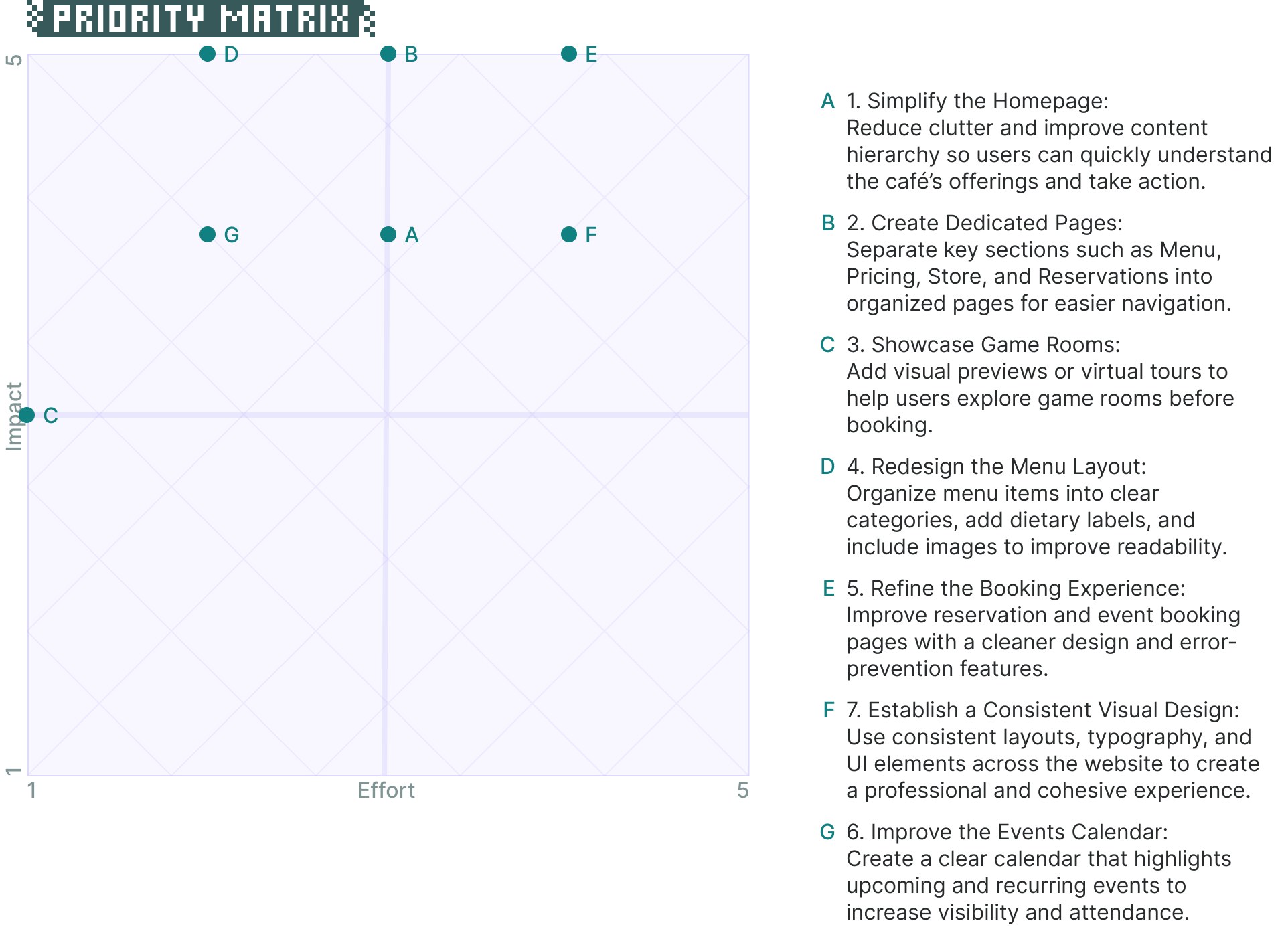
I weighed each recommendation by its impact on users against the effort to build it. This kept the owners and me aligned on what to tackle first, within real limits on time and cost. High-value, low-effort changes, like redesigning the menu layout and simplifying the homepage, came first.
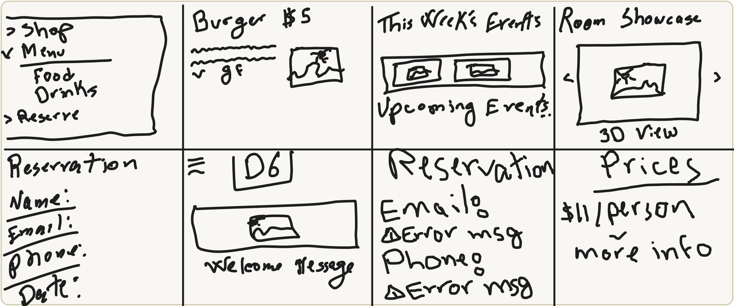
Crazy 8s
Crazy 8s let me get ideas out quickly without overthinking them, from a game room showcase to a reworked reservation form. Without pressure to be practical in the moment, it became easier to picture what the website could look like and how it might work.
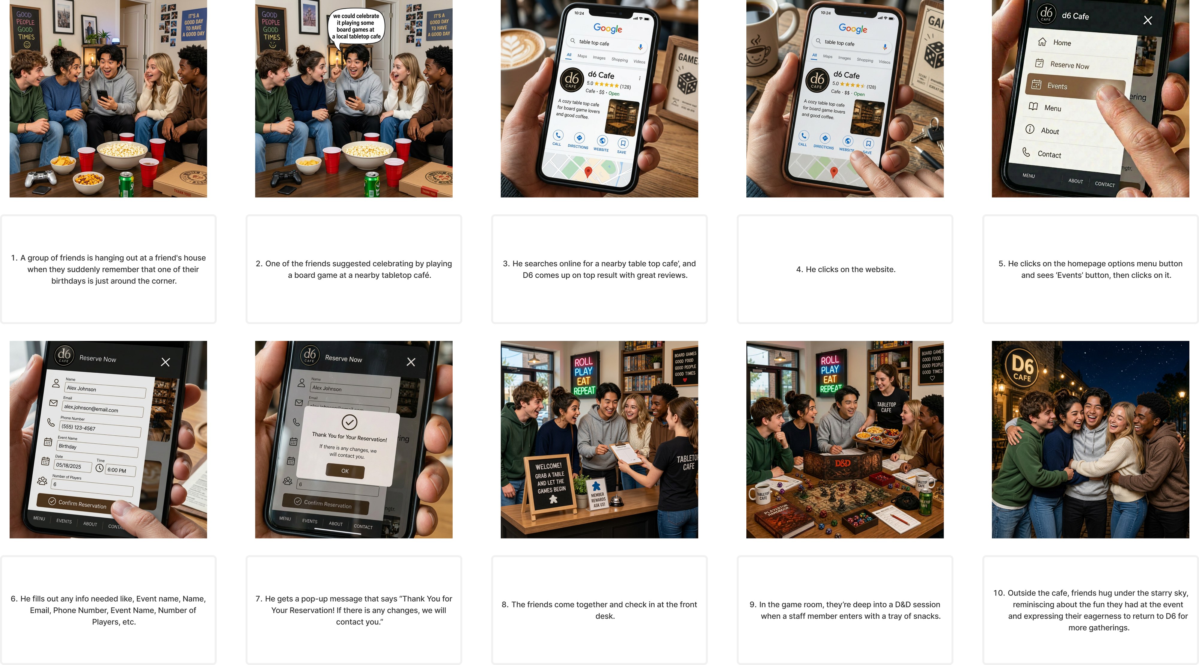
Storyboard
I storyboarded a realistic scenario: a group of friends planning a birthday game night. One of them finds D6 on Google, books an event on the site, and the group checks in and plays. It showed me how people might find and use the site in an everyday context, and where friction could show up along the way.
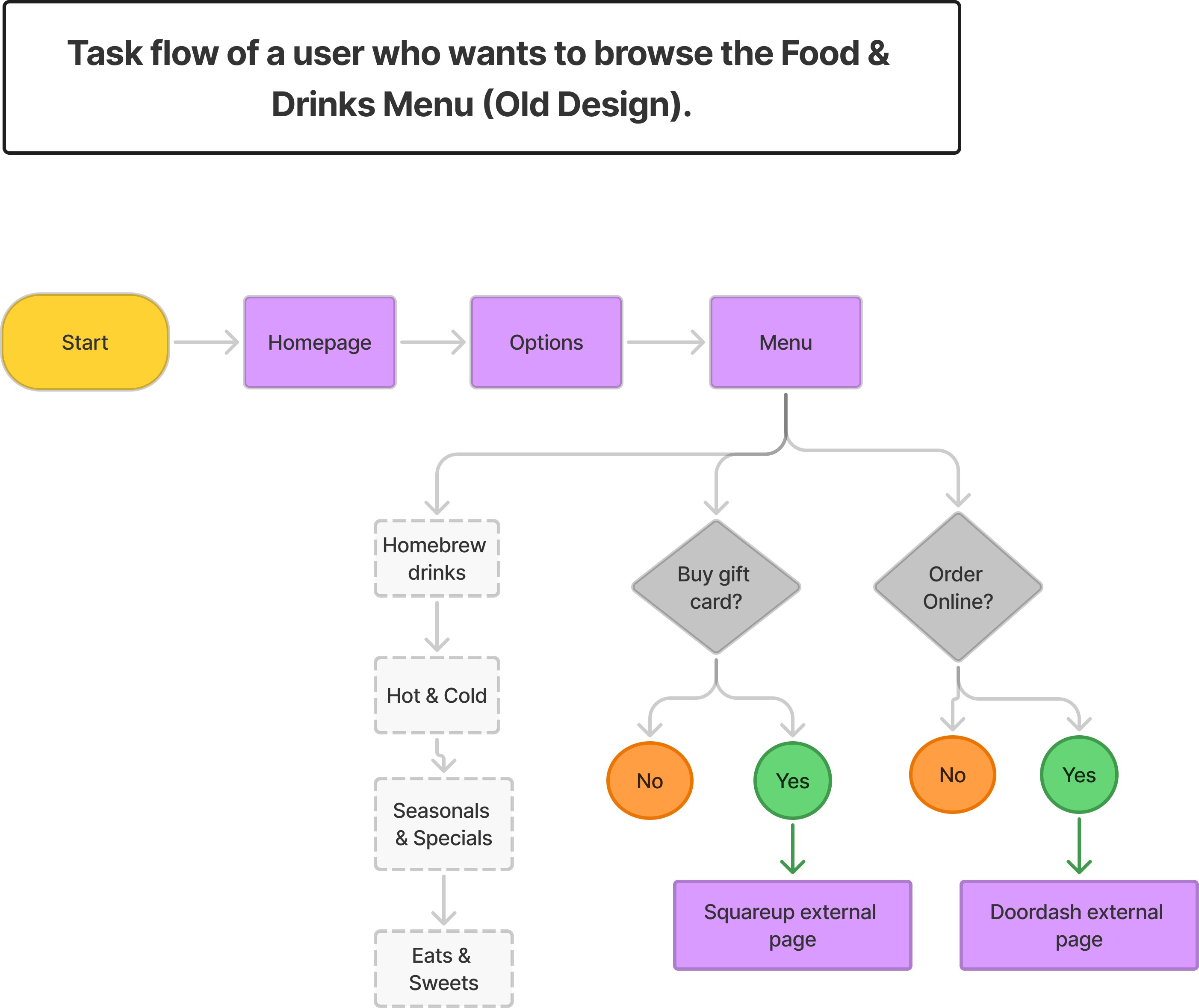
User flows
Menu. The original menu felt cluttered. A gift card option was misplaced inside it, and items lacked dietary info, descriptions and images.
- Moved the gift card option to the hamburger menu.
- Added dietary icons (Vegan, Gluten-Free, Dairy-Free).
- Introduced expandable cards that reveal descriptions and images.
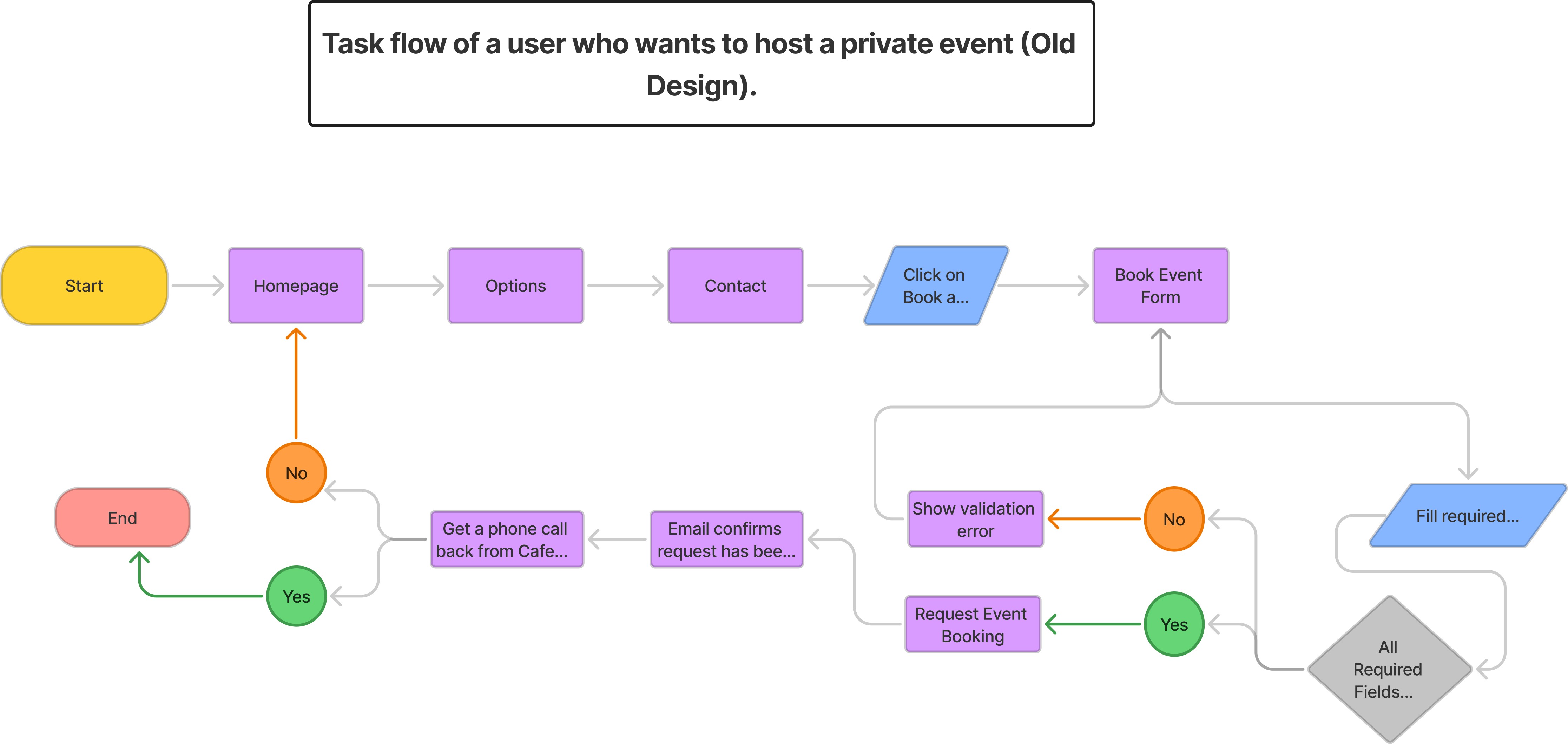
Reservations. Error messages blended into the primary colors, so they were easy to miss, and there was no confirmation step before submitting.
- Added inline validation with red error messages and warning icons.
- Placed a "Clear All" button above the confirmation area.
- Introduced a confirmation dialog before final submission.
03
Usability testing
I ran a usability study with four participants to check whether the design felt intuitive and easy to navigate, and to find friction points that needed attention.
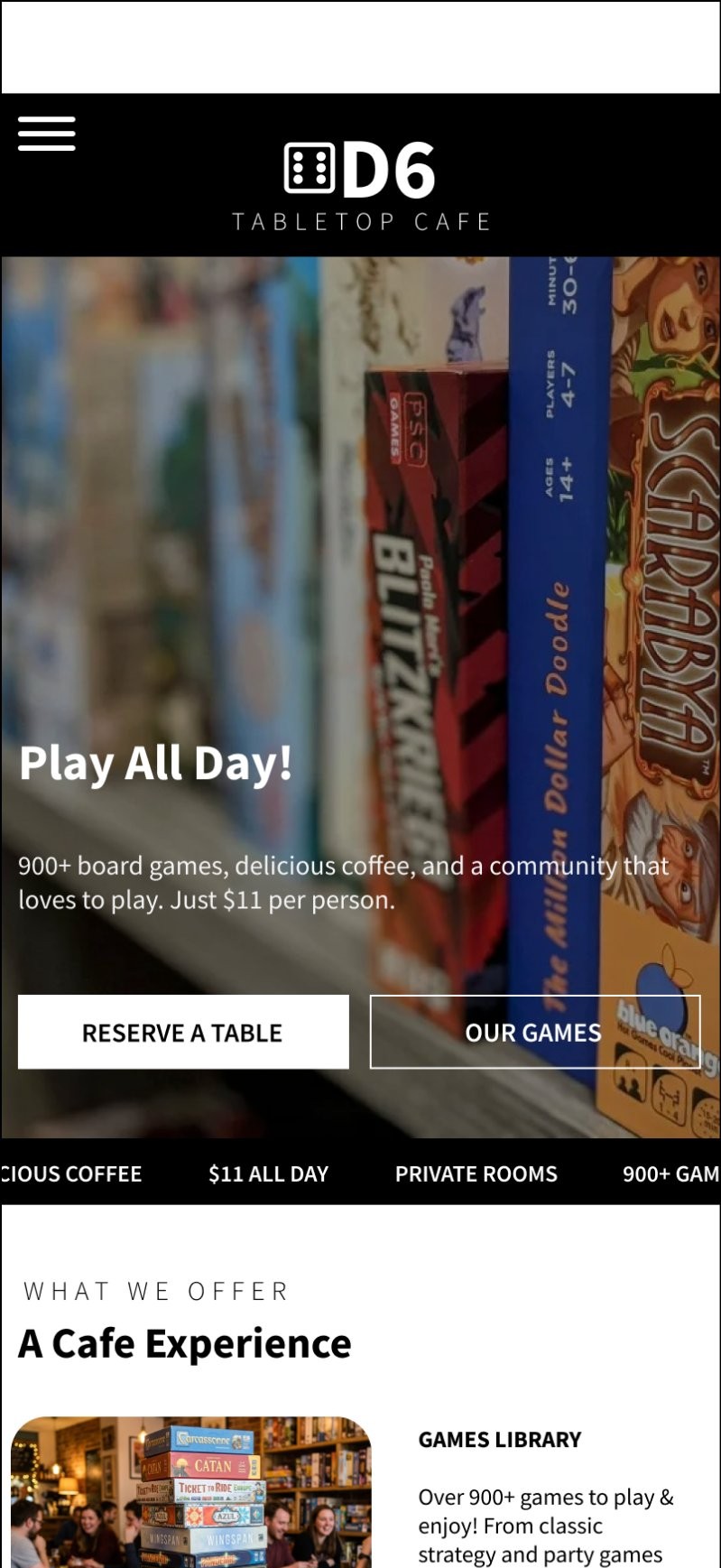
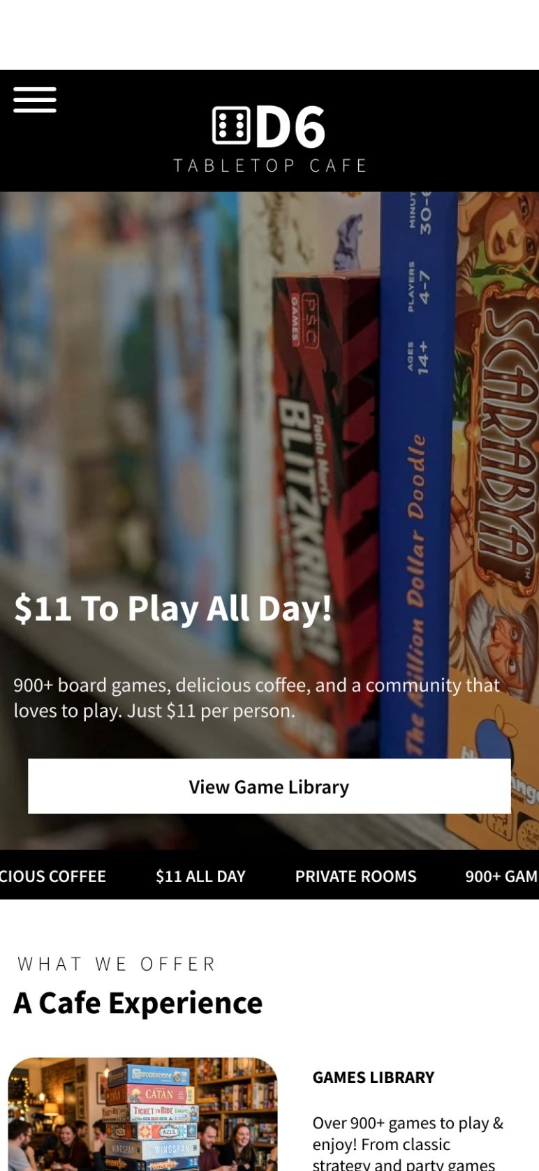
Problem 1
The top of the homepage lacked clear pricing, and a redundant reservation button added clutter, since booking was already available elsewhere.
Solution
I revised the header to show pricing up front and removed the redundant button. Booking remains available from the hamburger menu and the footer of every page.
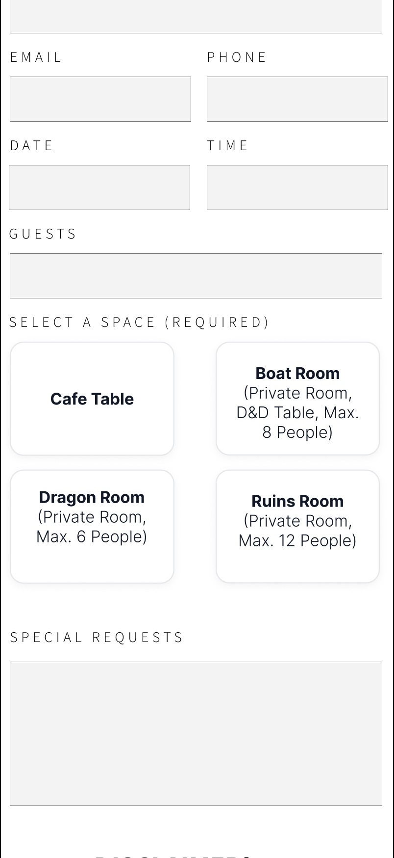
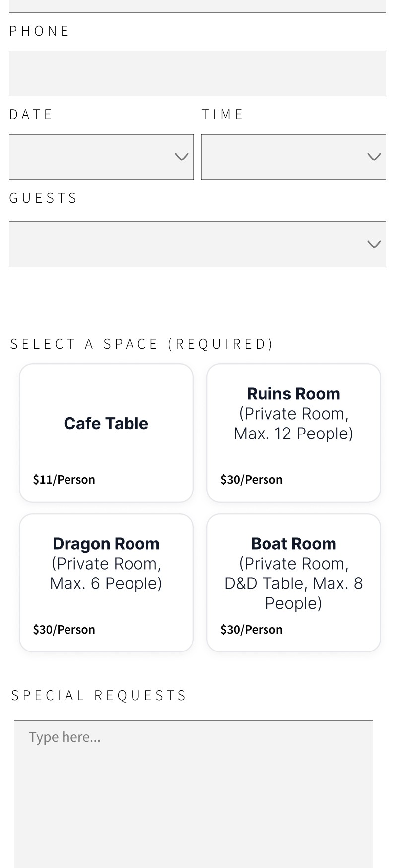
Problem 2
Room pricing wasn't visible, so users had to dig through several pages to find it before booking.
Solution
I added room prices directly beneath each room card on the reservation page, so pricing is right there at the point of decision.
Re-testing the fixes
I tested the revised design with two new participants to check that the fixes worked. Ratings rose from 8–10 in the first round to 9–10 out of 10.
Both found pricing much easier to see: it's the first thing they noticed at the top of the homepage, and room prices on the reservation cards meant they no longer had to hunt for them.
- First round
- 8–10
- After fixes
- 9–10
4 participants
2 new participants
Outcome
Impact
The design was shaped with the client and grounded in their goals: driving foot traffic, reducing staff enquiries, showcasing the game rooms, and promoting events. Key priorities included simplifying navigation, enhancing event cards, and adding a dedicated game rooms page.
The owners responded positively to the prototype and are interested in adopting it. Testing led to more prominent pricing and less redundancy. Participants described the design as minimalist and intuitive, and after the fixes, two new participants rated it 9 to 10 out of 10, up from 8 to 10.
Learnings
In-person recruitment at the café didn't work, so I switched to online interviews. That cost a week, but it made me a better interviewer and recruiter.
I also kept refining past the original timeline. The lesson: weigh user impact against effort, the same way the priority matrix taught me to, and know when a design is ready to ship.
Conclusion
The old site's outdated design, cluttered navigation and unreliable booking led to constant staff enquiries and low engagement with events and rooms. The redesign makes events, reservations and menus easy to find on your own, and re-testing confirmed the fixes worked.