Self-initiated · Mobile app
Second Thought
A calm app that helps people pause before an impulse purchase, and reflect on it afterward.
The problem
People buy things they regret when they're stressed, bored or scrolling, and most money tools only help after the fact.
What I did
Four user interviews, which turned a post-purchase idea into a pre- and post-purchase app. Then sketching, flows, and usability testing with a re-test after fixes.
The result
Five improvements from testing. Ratings rose from 7–10 to 9–10 out of 10 after the fixes.
The problem
People frequently buy things they later regret, especially when stressed, bored, influenced by others, or scrolling shopping apps. These purchases often go unused, create clutter, and feel like wasted money. Returning items is usually too much effort, so the regret stays.
Most existing tools focus on budgets, deals, or tracking after the purchase. Very few help people make a calmer decision in the actual moment of buying.
The idea
When someone is about to buy something, Second Thought offers a short check-in based on their goals, like reducing clutter, saving money, or buying less impulsively. A few tailored questions later, they can wait, save the item for later, or go ahead if they're sure.
It never makes the decision for them. It gives them context and keeps the final call in their hands, without judgment or guilt.
01
Research
User interviews
I interviewed four participants about their purchasing habits, why they regret certain purchases, what situations lead to impulse buying, and whether support would help more before or after a purchase.
Underused or unused items were the biggest source of regret, especially clothes, shoes and other things that created clutter. Participants also found returns inconvenient, often keeping, storing or donating items instead.
The strongest theme was wanting support before buying. That changed the project. I had started with a post-purchase reflection concept, but rather than scrapping it, I expanded Second Thought into a hybrid that helps people before they buy and lets them reflect afterward.
Help before buying
Three out of four participants preferred support before making a purchase.
Emotions drive impulse buys
Stress, boredom, social influence and impulse were the common triggers.
Simple questions, not tracking
Participants wanted guidance without feeling judged or overwhelmed.
02
Design
Mind map
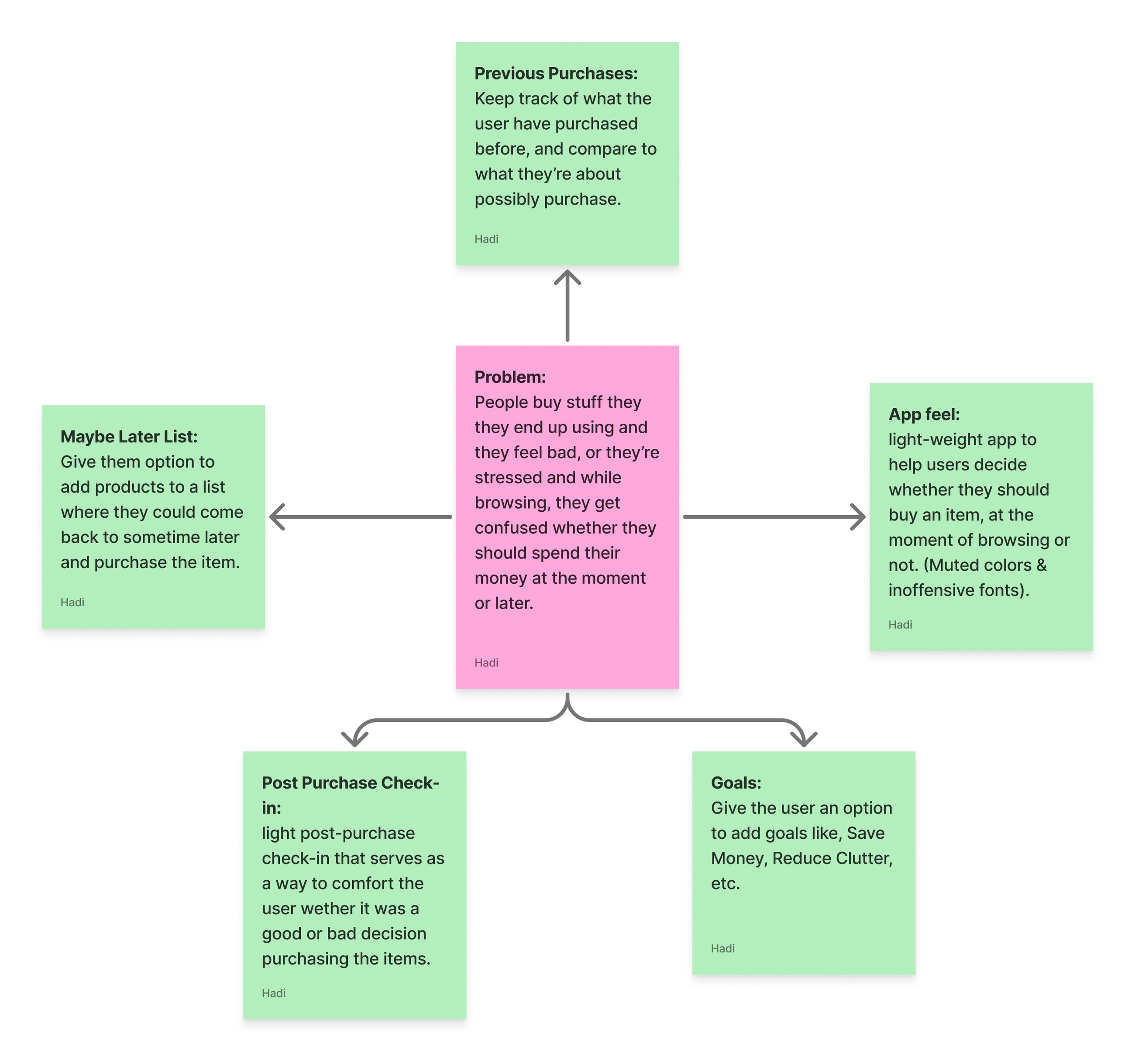
I mapped the app's core concept and the features that could help someone recognize whether a purchase is right for them now. It branched into five ideas: a Maybe Later list, a record of previous purchases, personal goals, a light post-purchase check-in, and the app's overall feel, with muted colors and gentle type. In the final app, these became Saved, Reflect and Goals.
Crazy 8s & sketches
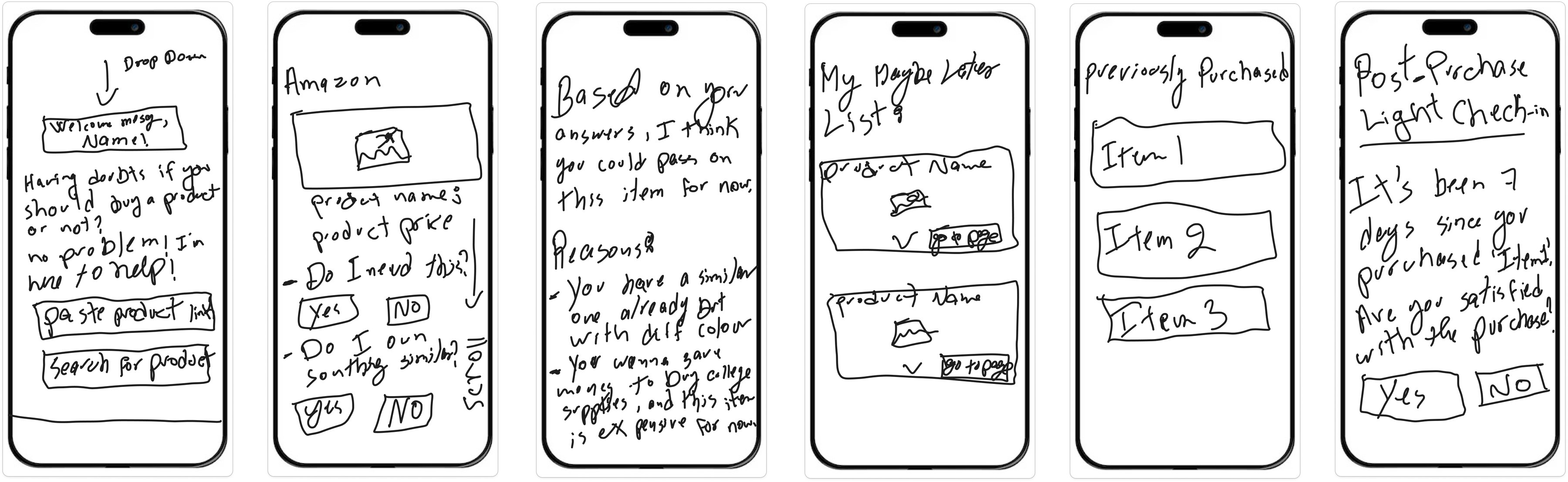
I started with Crazy 8s to explore ideas quickly without getting attached to one: a welcome screen with a paste-a-link field, a Maybe Later list, previously purchased items, and a light post-purchase check-in.
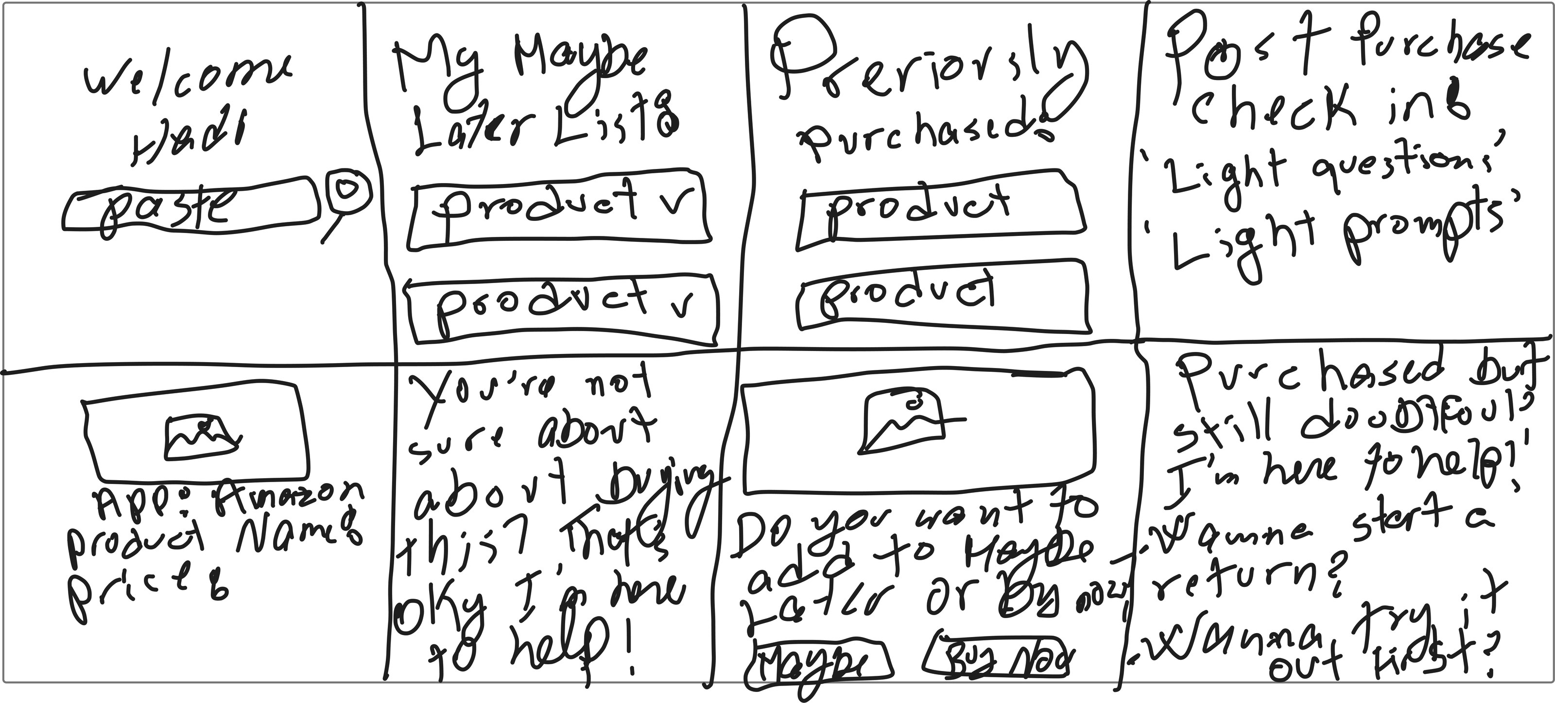
I then sketched the strongest ideas as phone screens, focusing on the core interaction: paste or search for a product, answer a few short questions, and get a recommendation with clear reasons. I also sketched the Maybe Later list, previous purchases, and a check-in seven days after buying.
Storyboard
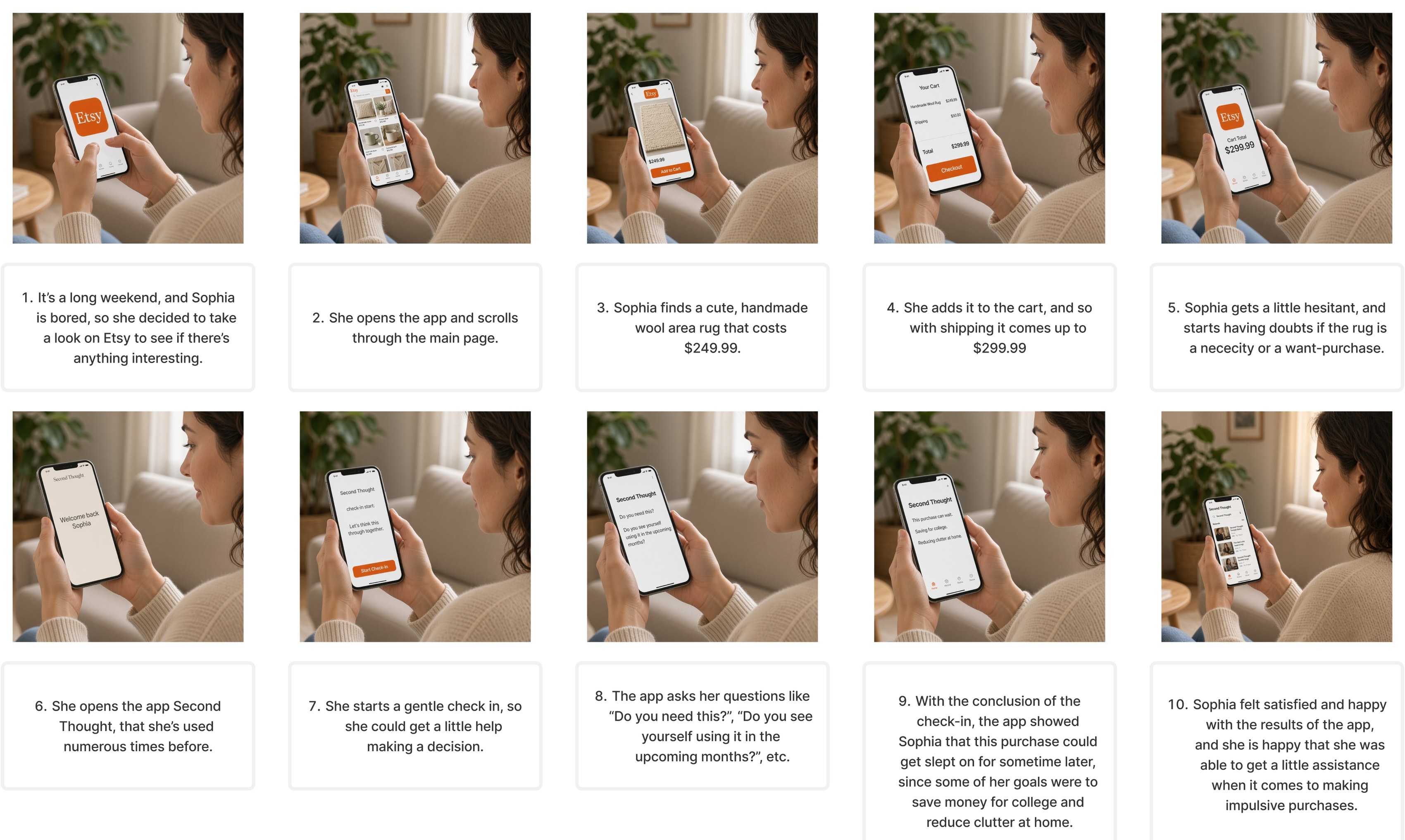
On a long weekend, a bored Sophia browses Etsy and finds a handmade wool rug: $249.99, or $299.99 with shipping. At checkout she starts to wonder whether it's a need or a want. Instead of acting on impulse, she opens Second Thought, answers a few gentle questions, and the app factors in her goals: saving for college and reducing clutter. She realizes the item can wait, and she feels more confident, without pressure or shame.
User flow
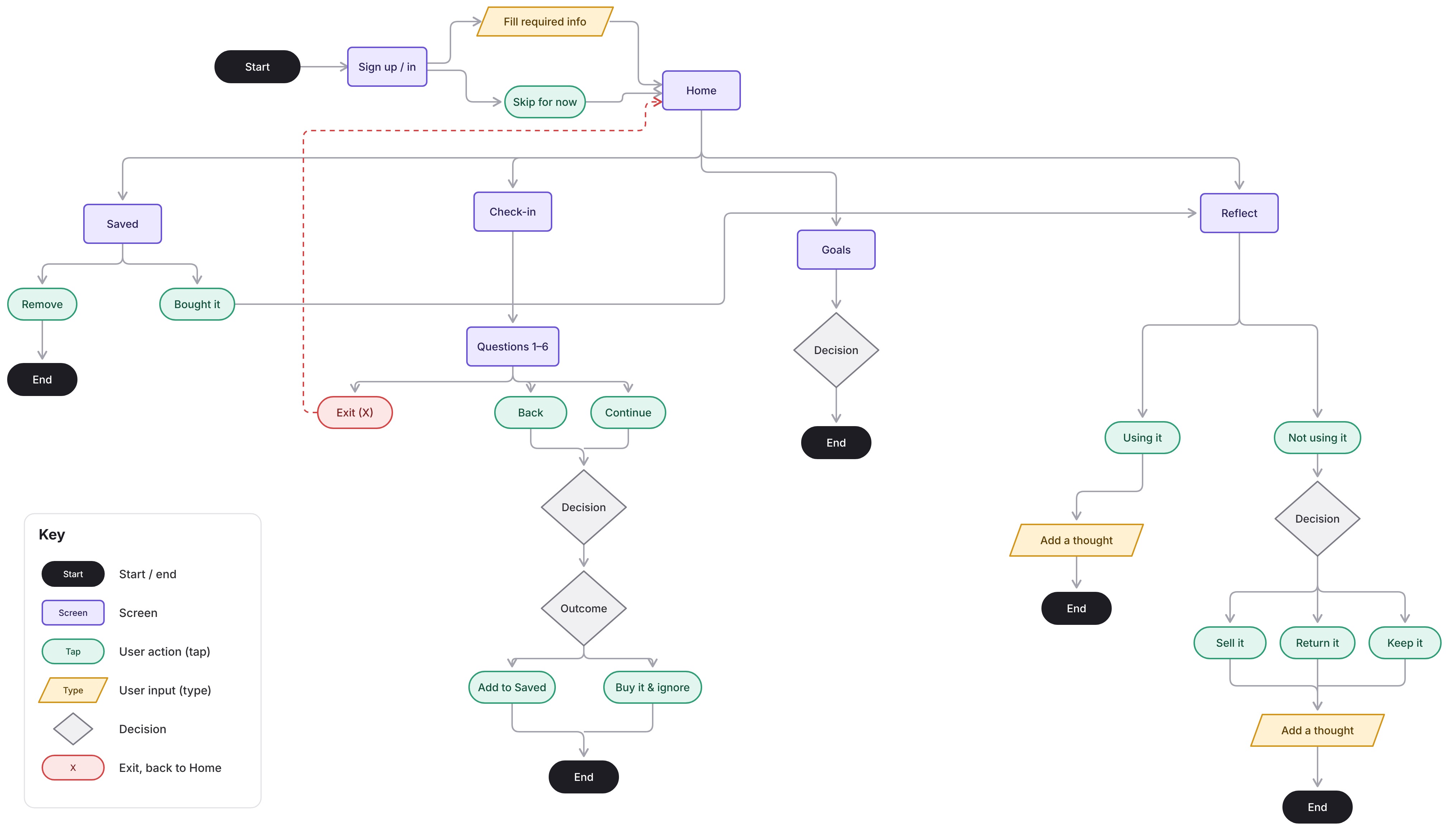
Users can sign up so their items are saved, or skip and explore first. From the homepage they start a Check-in, which can take their Goals into account. Items they're unsure about go to Saved, where they can remove them or mark them as bought. After buying, Reflect lets them look back on whether it was worth it.
Evaluate → Decide → Purchase → Reflect
03
Usability testing
I tested with four participants, who rated the experience between 7 and 10 out of 10. Those scores came before any of the changes below. They found the check-in simple and felt it helped them slow down and rethink impulsive purchases without the app deciding for them. Goals kept priorities in mind, Saved made it easy to revisit items, and participants liked using Reflect to spot patterns like overspending.
Testing also surfaced five problems worth fixing:
Problem 1
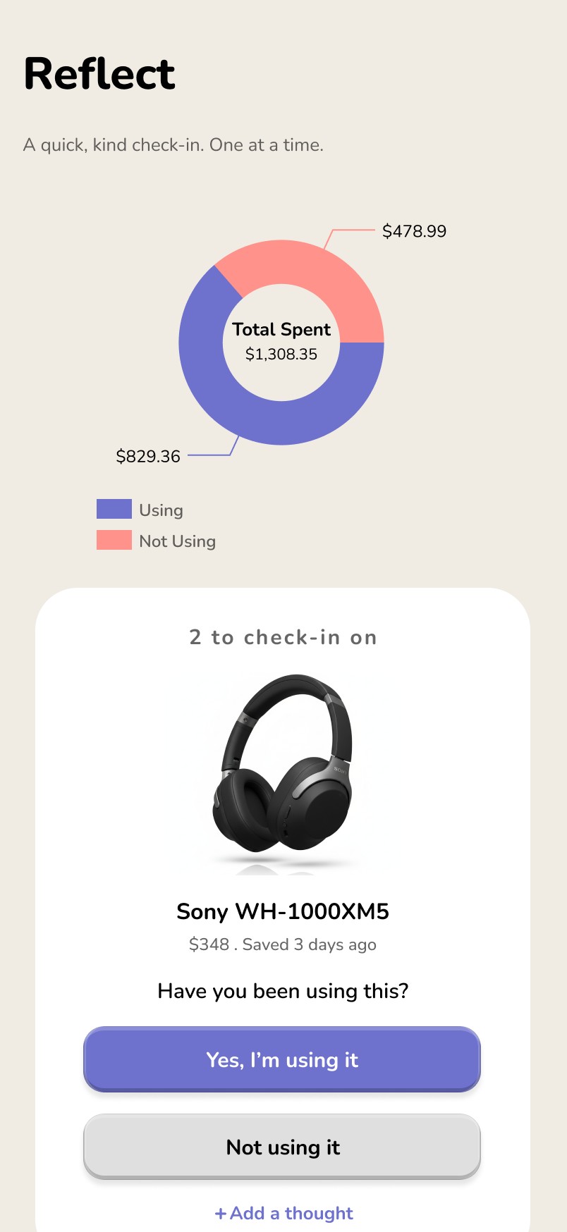
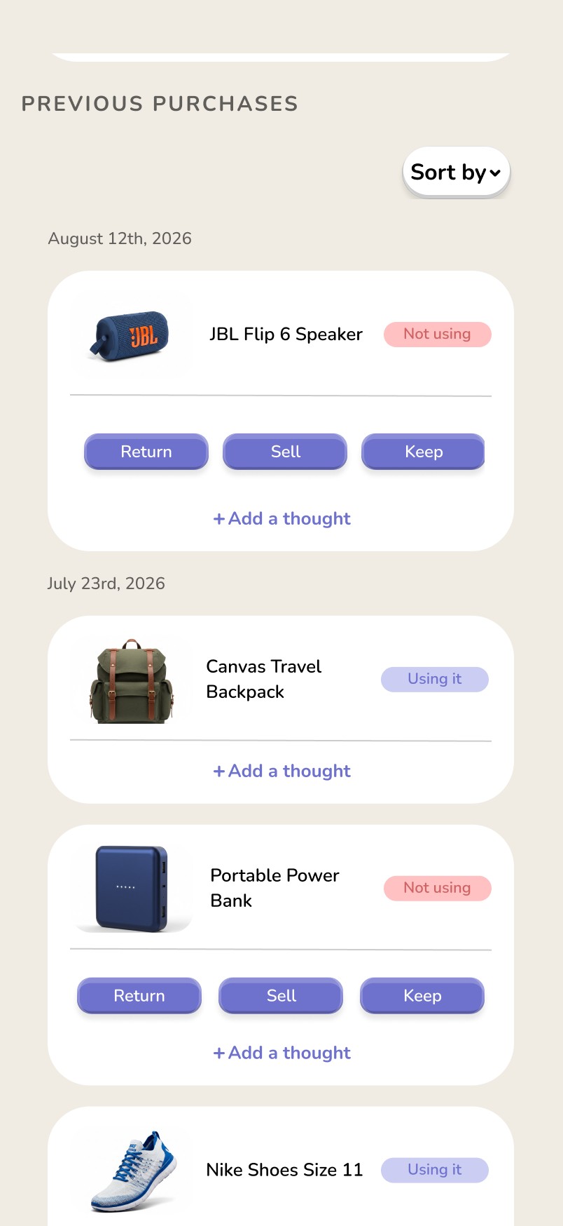
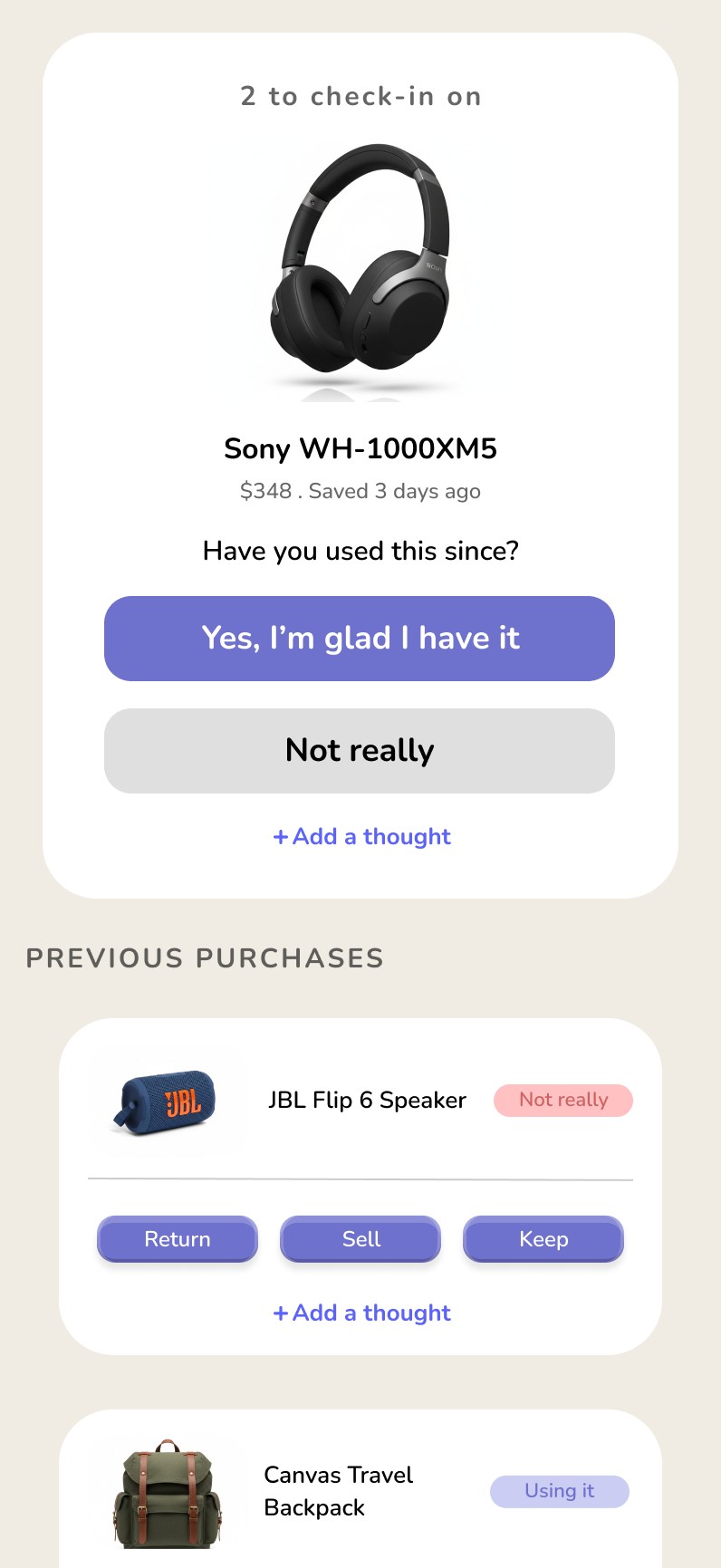
Users wanted more context about previous purchases, such as purchase dates and spending totals.
Solution
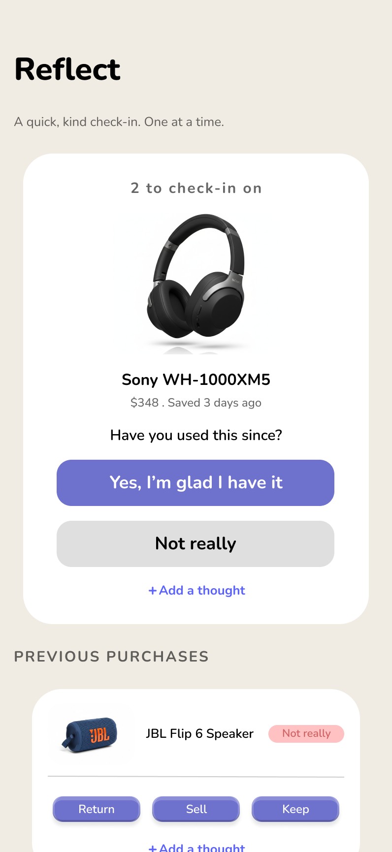
I added purchase dates and spending totals, a filter to sort items oldest to newest or the reverse, and a pie chart on Reflect showing total spending split between items people used and items they didn't.
Problem 2
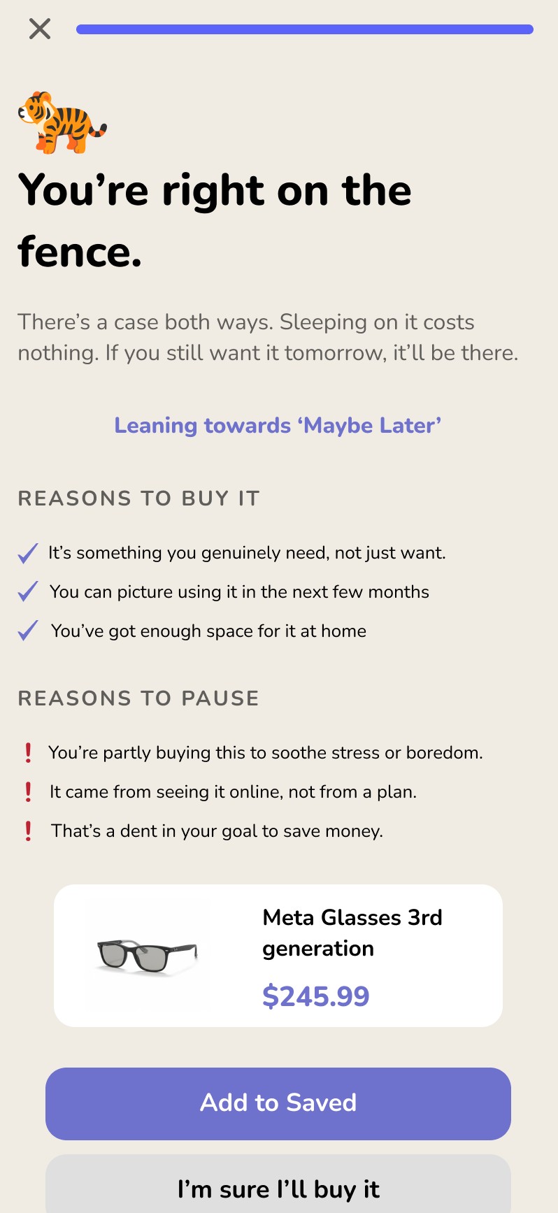
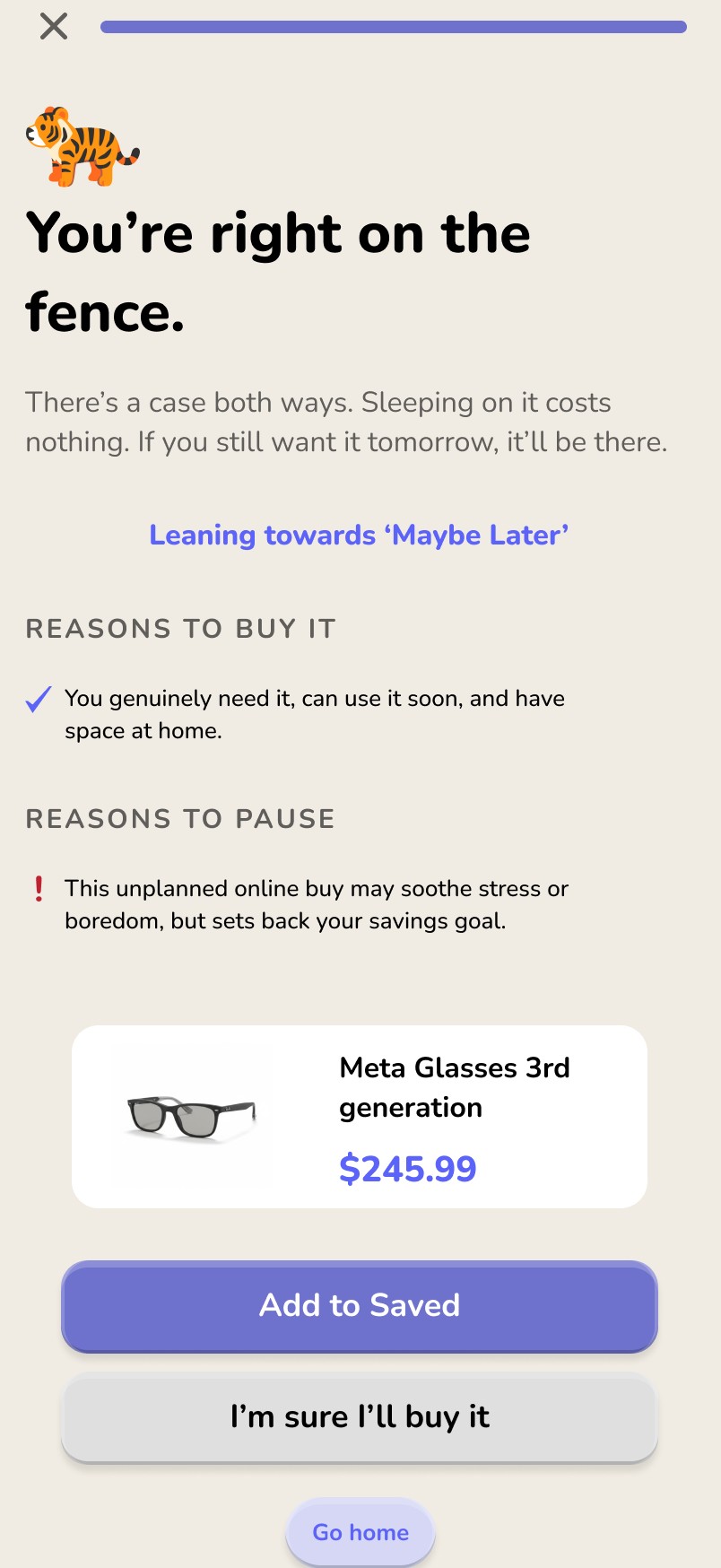
Results felt overwhelming. Several statements explaining why a purchase might be worth making now or later meant too much reading.
Solution
I condensed the results into a scannable format, so users get the key takeaway at a glance.
Problem 3
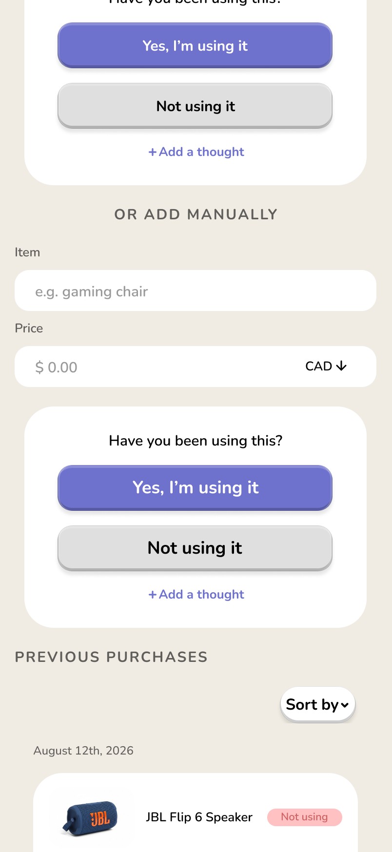
Users wanted to log purchases made outside Second Thought, but had no way to do it.
Solution
I added manual entry on the Reflect page, so users can track their habits even when a purchase didn't go through the app.
Problem 4
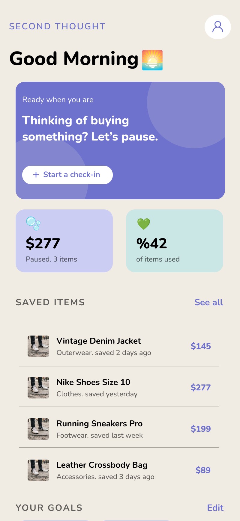
The "items paused" and "money saved" metrics on the homepage were confusing.
Solution
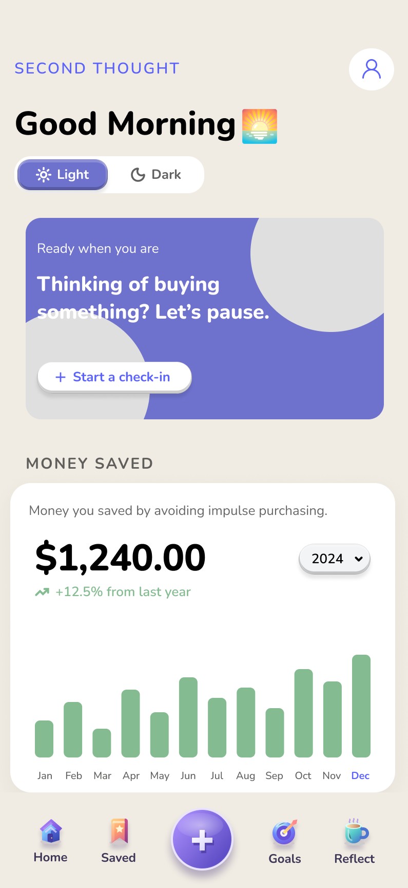
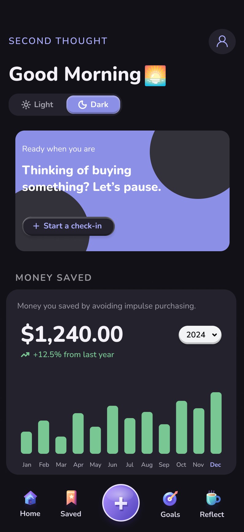
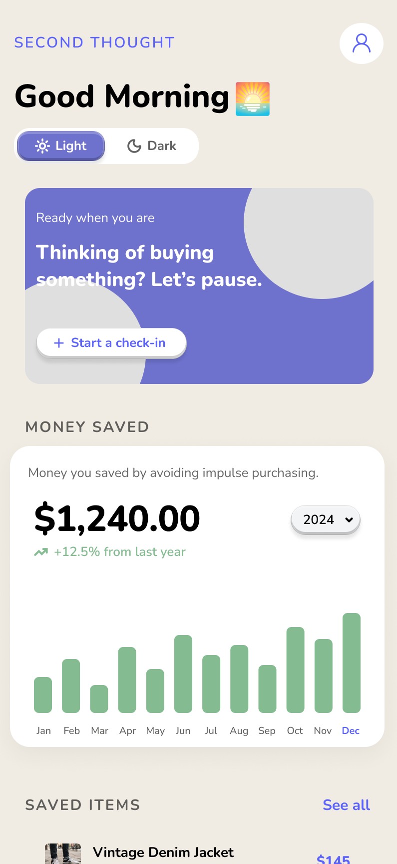
I replaced them with one yearly figure: how much money users have saved by avoiding impulse purchases.
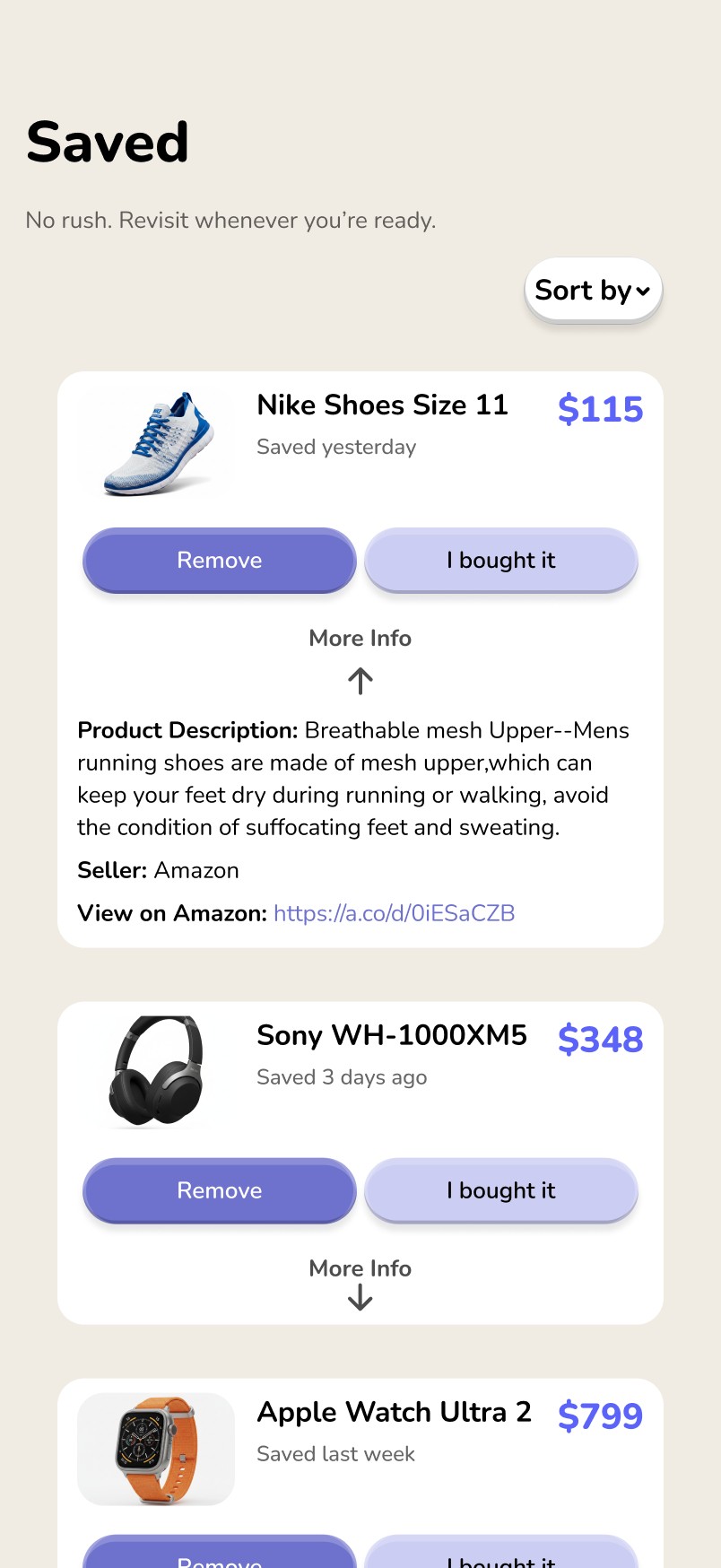
Problem 5
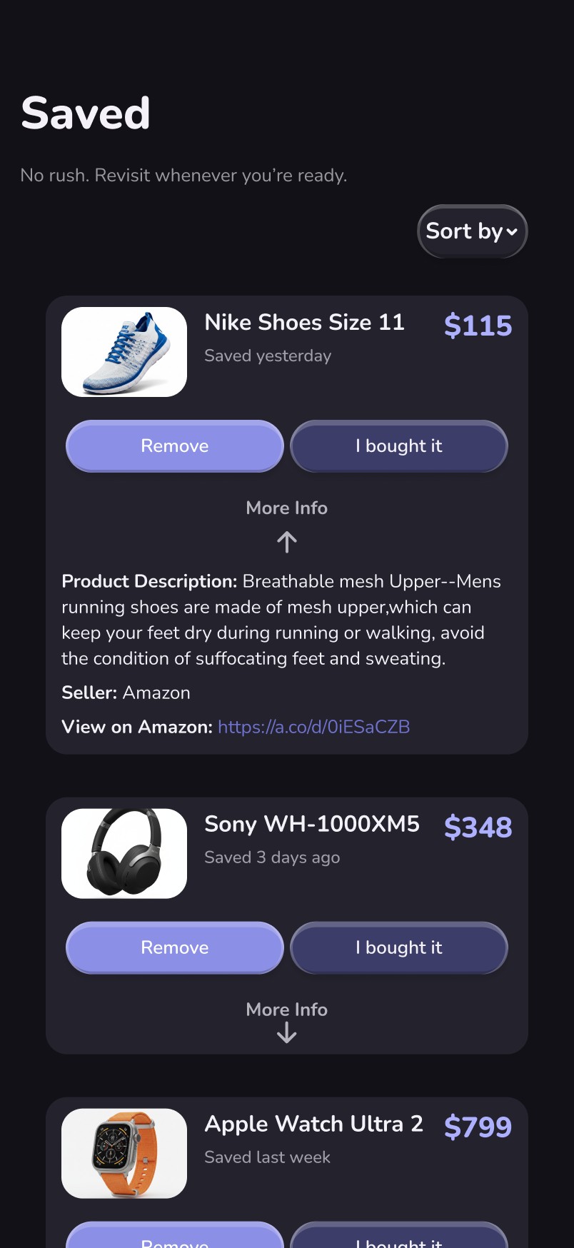
Users found light mode uncomfortable, and some reported getting migraines while scrolling.
Solution
I designed a dark mode that's easy on the eyes while keeping Second Thought's lightweight feel.
Re-testing the fixes
I tested the updated app with two new participants. Ratings rose from 7–10 in the first round to 9–10 out of 10.
They especially liked the yearly savings metric on the homepage and the pie chart in Reflect showing their total spending. They also said it looked more modern, pointing to the 3D highlights on buttons and colors that work in both light and dark mode.
- First round
- 7–10
- After fixes
- 9–10
4 participants
2 new participants
"I really like the way it looks now. After seeing the older version, this looks like it's actually ready for launch and people can actually use it!"
"It's really good, honestly. The UI, the ease of use, the simple wording. I'd give it a 9.5 to 10, and I'd definitely use it if it launches!"
Outcome
Impact
Participants rated the first version 7 to 10 out of 10, and their feedback drove five targeted changes: dates, totals and a pie chart in Reflect; results you can scan; manual entry for outside purchases; one clear yearly savings figure; and a dark mode that's easier on the eyes. In a re-test, two new participants rated the updated app 9 to 10 out of 10. The result is a clearer, more intentional experience that keeps users focused on their goals, not just their cart.
Learnings
Let research change the idea. Interviews showed people wanted help before buying, so I expanded my original concept instead of defending it.
Personality matters. The first version felt flat, so I added depth, 3D touches and color, and built a dark mode that stayed easy on the eyes.
Data has to earn its place. Users wanted to track spending, but I didn't want numbers to clutter a lightweight app. After several iterations, a simple graph and pie chart made it clear enough to use, not just look at.
Conclusion
Second Thought shows how a small pause can change a purchase decision. Four research interviews, usability testing and a re-test of my fixes shaped it into a calm app that guides people without judging them. Next, I plan to improve how saved items are organized and add more customization, based on testing feedback.